In case you haven’t noticed, STALKR started off the summer with a little facelift: a complete rebranding and redesign of our website, creating an overall aesthetic that’s representative of who we are, what we do and where we are going.
The rebrand started with a reconcepting of our logo. In the early days of STALKR, when Vimeo was just a shell of what it is now and viral videos weren’t a constant occurrence, the balance of our work tilted toward heritage campaigns rather than the contemporary aesthetic we are now known for. As such, our logo was a reflection of that time, emphasizing our archival work and its vintage feel.
To bring STALKR into the modern day, we chose a new logo that reflects the caliber and nature of the work we are producing today. Not just another 20th century geometric revival, the radical font behind our logo was designed only a few years ago. Its 21st century pedigree underlines our forward-thinking approach to producing content that feels incredibly fresh, like it was shot yesterday. Because, in many cases, it was!
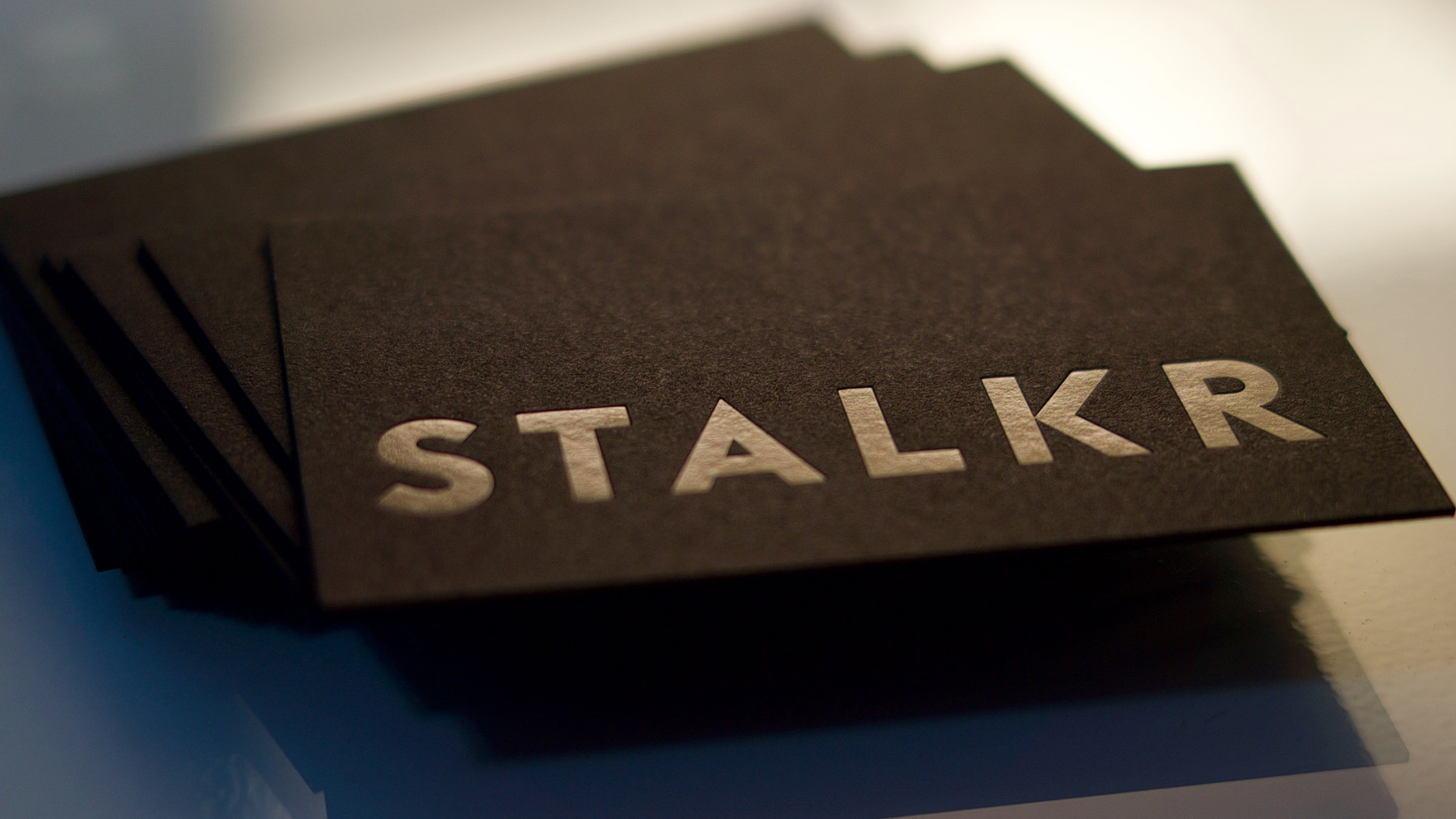
In line with the new logo, we launched into a new collateral design (including business cards pictured above), and a new website to match.
Keeping the same principles of the logo, the website was built to reflect STALKR’s evolution and the work itself. The new site honors the work and visuals from the stories we produce, creating an immersive experience for the user; get a couple clicks deep and you’ll always find something that you will want to engage with.

 Los Angeles